
How We Translate an Interior Design Concept into Original Artwork
An interior designer rarely begins an artwork commission with a completely blank sheet of paper. There may already be a detailed concept, a palette of fabrics and finishes, architectural drawings, reference images and a clear idea of how the room should feel.
The challenge is to translate all of that information into artwork that belongs within the scheme without merely reproducing the mood board. The finished piece needs to complement the interior, but it should also have enough individuality and character to stand on its own.
At Artistic Licence, this process combines interpretation, practical design development and artistic judgement. Here is how we turn an interior design concept into original artwork.
Beginning with the room
We start by understanding the space in which the artwork will be seen.
A painting above a hotel bed has a different role from a large feature piece in a reception, a sculptural work on a staircase or a collection arranged along a corridor. Viewing distance, furniture, lighting and surrounding finishes all affect the appropriate composition, scale and level of detail.
Useful information at this stage includes:
- Room elevations, plans or photographs
- The intended position and approximate artwork size
- Design presentations and mood boards
- Fabric, wallpaper, paint and joinery samples
- Reference imagery
- The required mood or atmosphere
- Framing preferences
- Budget, quantity and programme
The brief need not prescribe the finished artwork. It should give us enough information to understand the design intention and the practical requirements.
Identifying what matters in the concept
A design concept contains many visual cues, but they do not all need to appear literally in the artwork.
We look for the underlying qualities that give the scheme its identity. These might include a restrained natural palette, strong architectural geometry, weathered surfaces, a sense of movement or references to the building’s location and history.
Sometimes a designer is drawn to a reference image because of its composition. At other times, it may be the texture, looseness of the marks or balance between quiet and energetic areas. Understanding the reason behind a reference is more useful than simply copying what it depicts.
This is where interpretation begins. The aim is to preserve the character of the interior concept while developing a new piece with its own composition and visual identity.
Using references without copying them
Reference images are an effective way to communicate a preferred direction, but commissioned artwork should be an original response rather than a reproduction of somebody else’s work.
We may take cues from the proportions, palette, visual weight or technique of a reference, then rearrange the forms, alter their scale and introduce different marks or materials. If several references have been supplied, elements can be combined into a new direction that is better suited to the room.
This approach also gives the designer greater control. Instead of searching for an existing image that is almost right, the composition can be created specifically for the required dimensions, colours and location.
Working with colour and materials
Colour displayed on a screen is not reliable enough for close coordination with an interior. Different monitors, phones and lighting conditions can make the same colour appear noticeably different.
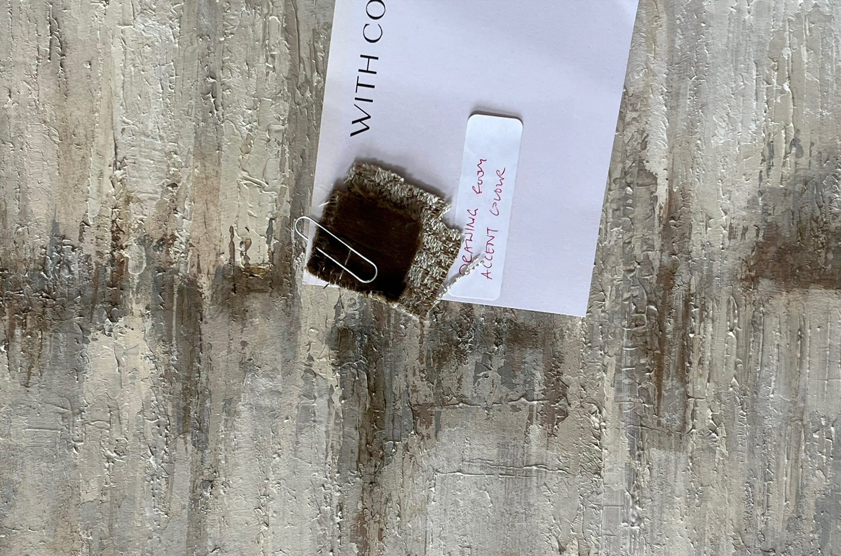
Where colour is important, we prefer to work from physical samples. Fabrics, paint chips, flooring, timber and metal finishes allow us to judge undertones and relationships much more accurately.
The artwork does not necessarily need to match every colour exactly. Often it is more successful when it picks up selected tones and introduces subtle variations. This prevents the piece from looking over-coordinated while still making it feel connected to the room.
Materials can influence the artwork just as strongly as colour. A scheme containing aged brass, natural timber and heavily woven fabrics might suggest layered surfaces, metallic details or a more tactile finish. A cleaner contemporary space may call for a quieter composition and a more controlled surface.
Choosing the right medium
The same concept can often be developed in several different ways. The intended location, quantity, budget and desired impact help determine the most appropriate method.
Options might include:
- An original painting on canvas, paper, MDF or panel
- A painting created specifically for high-resolution scanning and print production
- A bespoke digital or mixed-media print
- A layered collage or textile-based piece
- A three-dimensional relief or sculptural panel
- An original sculptural piece that is moulded and cast for repeated use
For a prominent public space, a one-off original may be the right solution. Across hotel bedrooms or apartments, creating an original painting and reproducing it as a high-quality print can offer greater flexibility. It retains the character of handmade artwork while allowing the image to be resized, cropped or varied for different room types.
For repeated 3D artwork, we can make an original relief, create a mould and cast the required quantity. The individual pieces can then be finished consistently or given subtle differences in colour, metallic treatment or arrangement.
Designing to the correct proportions.
Artwork should be developed for the shape of the intended space, rather than forcing an existing image into unsuitable dimensions.
If a piece is required above a wide headboard, its composition needs to work horizontally from the outset. A tall, narrow wall or double-height space requires a different balance. Designing at the correct proportions avoids awkward cropping and ensures that the important visual elements sit comfortably within the finished piece.
Where an original will later be scanned and printed, we consider how the image may need to adapt across the project. Additional image area can sometimes be created around the principal composition, allowing different crops to be produced without losing its essential character.
Developing digital concepts
Before the finished artwork is made, we normally produce digital roughs or visual mock-ups.
These establish the main composition, colour balance and proportions. Where room elevations or good photographs are available, we can show the proposed artwork in position. This helps the designer and client assess its scale and relationship with the furniture, lighting and architecture.
Digital concepts are not intended to predict every brush mark or texture. Their purpose is to agree the direction before production begins. Handmade work will naturally develop as paint, texture and materials are applied.
For a larger scheme, the concepts also allow us to review the collection as a whole. Pieces may share a palette or visual language without becoming repetitive.
Refining the proposal
The concept stage is the right point to make changes. A shape can be moved, a colour reduced or a composition made quieter before significant making time and materials have been committed.
Clear, consolidated feedback is particularly helpful. If the designer gathers comments from the client and wider project team into one response, revisions can be made efficiently and contradictory instructions avoided.
Once the composition, palette and general approach have been approved, we move into production.
Allowing the finished artwork to develop
An approved digital visual provides direction, but it should not remove all creative judgement from the making process.
The qualities that make original artwork interesting—layering, brushwork, texture and small variations—often emerge through working with the materials. If every mark were predetermined, the result could feel mechanical.
Our role is to remain faithful to the approved concept while allowing the finished work to acquire depth and character. The degree of variation depends on the commission: a one-off painting allows more interpretation, while an original intended for repeat production may need a carefully controlled composition and colour balance.
Reviewing and approving the finished piece
When the artwork is complete, we provide photographs for approval before framing or final production.
Square-on images show the overall composition, while close-up photographs can illustrate texture, surface detail and finish. Although a photograph cannot reproduce the full depth or colour of an original, this stage allows the designer to confirm that the completed work follows the agreed direction.
If the piece is the master original for a printed collection, it can then be professionally scanned or photographed at high resolution, colour-adjusted and prepared for the required print sizes and substrates.
Completing the artwork within the interior
Framing is part of the translation process, not simply a finishing detail. The profile, colour, mount and glazing should work with both the artwork and the surrounding interior.
A natural or stained timber frame might connect with joinery, while a slim dark or metallic frame can relate to lighting and ironmongery. A tray frame may suit a contemporary painting, whereas works on paper may benefit from a float mount or window mount with specialist glazing.
The strongest result is achieved when artwork, frame and interior are considered together. The finished piece should feel connected to the scheme without disappearing into it.
Original artwork shaped by the space
Translating an interior design concept into artwork is not a matter of matching a few colours or copying a reference image. It involves understanding the atmosphere, proportions, materials and practical needs of the room, then creating an original response that strengthens the overall design.
At Artistic Licence, we work with interior designers, architects, developers and private clients to create paintings, bespoke prints, mixed-media pieces and sculptural artwork. We can manage the process from the initial references and digital concepts through to production, framing, delivery and installation.
If you have a design presentation, room elevation or collection of samples, send them to us with the approximate sizes and project programme. We can recommend an appropriate creative and production approach for the space.
Frequently asked questions
Does the designer need to provide a finished artwork idea?
No. A mood board, room visuals, samples and an explanation of the intended atmosphere are normally enough to start developing a direction.
Can you work from a reference artwork?
Yes, references can communicate preferred colours, composition or technique. We use them to understand the direction, then develop an original response rather than copying another artist’s work.
Can artwork be matched to fabrics and paint colours?
Yes. Physical samples are preferable when close colour coordination is required, because colours viewed on screens vary considerably.
Can an original painting be reproduced for several hotel bedrooms?
Yes. We can create an original to the correct proportions and palette, then scan or photograph it at high resolution for print production. This provides flexibility across different sizes and room types.
Can three-dimensional artwork be repeated?
Yes. An original relief or sculptural piece can be moulded and cast in the quantity required. Finishes can be consistent or subtly varied across the collection.