
The Role of Colour in Custom Art: Enhancing Your Space’s Aesthetic
Colour plays a pivotal role in custom art, significantly impacting the overall aesthetic and mood of a space. Understanding how to use colour effectively can transform an environment, making it more vibrant, welcoming, or serene. By applying principles of colour theory and carefully selecting a colour palette, artists can create pieces that enhance and complement the existing decor. In this article, we will explore how different colours evoke emotions and influence perception, and how colour theory is applied in bespoke art projects to harmonise with existing colour schemes.
Emotional Impact of Colour in Art
Colours have the power to evoke a wide range of emotions and moods. For instance, warm hues like reds and yellows are often associated with energy and warmth, while cooler tones like blues and greens can create a sense of calm and relaxation. Understanding these associations is crucial for artists and interior designers when selecting colours for custom art pieces.
Examples of Colour Use to Influence Mood
Artists use colours strategically to influence the mood of a space. For example, a painting with a predominantly blue colour palette can bring a tranquil atmosphere to a living room, while a piece featuring vibrant, primary colours might energize a playroom or creative workspace. Complementary colours, such as blue and orange, can create visual interest and dynamic contrasts that draw the eye and add depth to a composition.
The Impact of Colour on Perception and Behaviour
The colours in a room can also affect how we perceive space and influence our behaviour. Light, neutral tones can make a small room appear larger and more open, while darker colours might create a more intimate, cosy atmosphere. Accent colours can highlight key elements of a room, such as architectural features or focal points, drawing attention to them. By understanding the principles of colour theory and the colour wheel, artists can select the perfect hues to achieve the desired effect in custom art projects.
At Artistic Licence, we specialise in creating bespoke art pieces that enhance your space’s aesthetic. Our expert artists are skilled in using colour to transform environments, ensuring that each piece harmonises with your existing decor.
Explore How Colour Theory is Applied in Bespoke Art Projects
Colour theory is a fundamental aspect of art and design, guiding artists in their choice of colours and how they combine them. This section will delve into the importance of colour theory in bespoke art projects and how it is applied to create harmonious and visually appealing pieces.
Definition and Importance of Colour Theory
Colour theory is the study of how colours interact with each other and the effects they produce when combined. It involves understanding the colour wheel, which organizes colours into a circular diagram, showing the relationships between primary, secondary, and tertiary colours. Primary colours (red, blue, and yellow) are the foundation of the colour wheel, from which all other colours are derived. Secondary colours (green, orange, and purple) are created by mixing primary colours. Understanding these relationships is crucial for artists when creating a balanced and cohesive colour palette.
Techniques for Selecting Colours That Complement Existing Colour Schemes
When working on bespoke art projects, it’s essential to select colours that complement the existing colour scheme of the space. Here are some techniques artists use:
1. Analysing the Existing Colour Palette
Before creating a custom piece, artists often analyse the existing colour palette of the room. This involves identifying the dominant colours and any accent colours used in the decor. By understanding the current colour scheme, artists can choose hues that will enhance and harmonise with the space.
2. Using the Colour Wheel
The colour wheel is a valuable tool for selecting complementary colours. Colours that are opposite each other on the colour wheel, such as blue and orange, are known as complementary colours and can create striking contrasts. Analogous colours, which are next to each other on the wheel, such as blue and green, provide a more subtle, harmonious blend. Artists use these relationships to create a balanced and aesthetically pleasing composition.
3. Incorporating Accent colours
Accent colours are used to highlight key elements of a design and add visual interest. In bespoke art projects, artists might use accent colours to draw attention to specific areas of the piece or to tie the artwork into the room’s decor. For example, a touch of gold in a painting can complement brass fixtures in a living room, creating a cohesive look.
4. Balancing Warm and Cool Tones
Balancing warm and cool tones is another technique used in colour theory. Warm tones, such as reds and oranges, can make a space feel more inviting and energetic, while cool tones, like blues and greens, have a calming effect. Artists often balance these tones to create a dynamic yet harmonious piece of art.
Role of Technology in Creating Bespoke Art
Advancements in technology have revolutionised the way bespoke art is created. Digital tools and software allow artists to experiment with different colour schemes and see how they will look in space before committing to a final design. This not only streamlines the creative process but also ensures that the final artwork will perfectly complement the room’s existing decor.
Predictions for the Evolution of Bespoke Art in Show Home Design
As we look to the future, bespoke art is expected to continue evolving, with even more integration of technology and innovative techniques. Artists will likely explore new mediums and methods, pushing the boundaries of traditional art forms. The use of AI and machine learning in art creation could lead to highly personalised and data-driven designs, tailored to individual preferences and market trends.
Furthermore, bespoke art will continue to add significant value to show homes. As buyers increasingly seek unique and personalised living spaces, the presence of bespoke art can set a show home apart from the competition. Art that reflects the latest trends in interior design and luxury living will attract discerning buyers who appreciate the finer details.
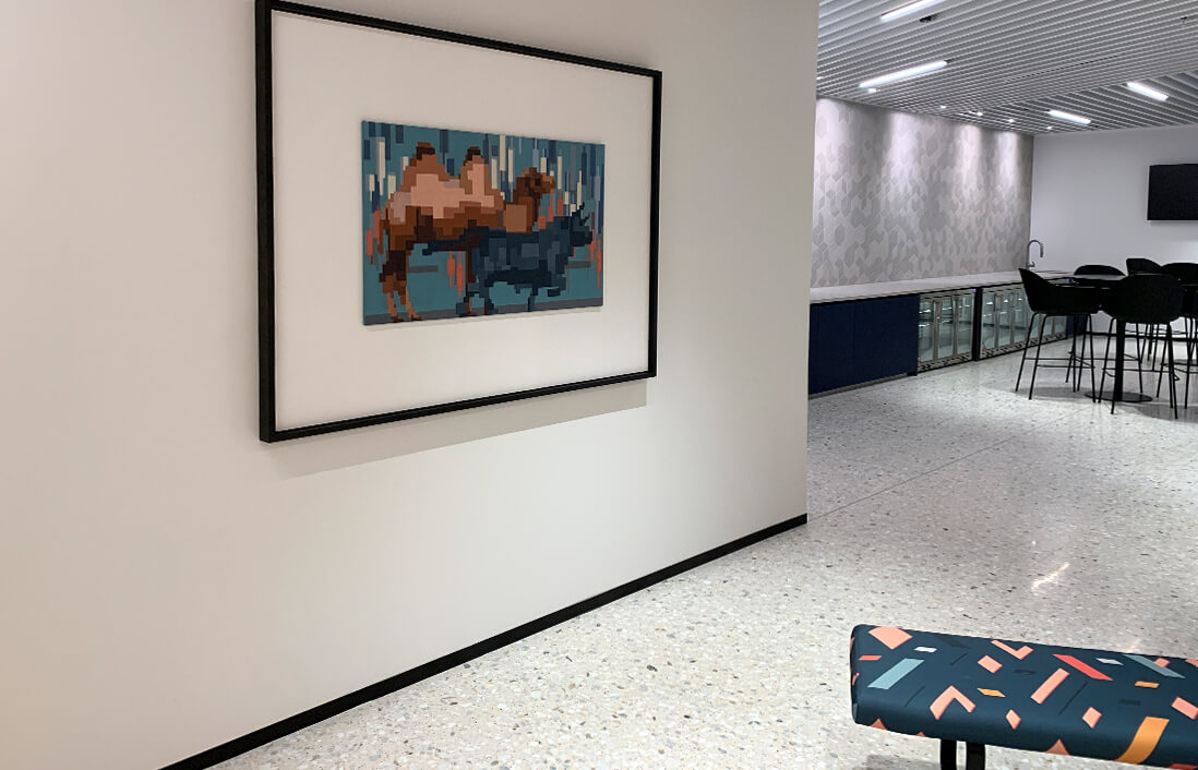
Tailoring Custom Art to Your Space’s Unique Characteristics
Incorporating custom art into your living space is a powerful way to express your personality and enhance your home’s overall ambience. Tailoring custom art to your space’s unique characteristics involves careful consideration of various elements such as natural light, size, function, and colour schemes. This process ensures that each piece of art not only harmonizes with your existing decor but also elevates the interior design.
Assessing the Space’s Natural Light, Size, and Function
The first step in selecting custom art is to assess the space’s natural light, size, and function. Natural light plays a crucial role in how art is perceived. A well-lit room can accommodate bold, vibrant pieces, while a dimmer space might benefit from lighter, more reflective works. Additionally, the size of the artwork should be proportional to the dimensions of the room. A large painting can serve as a striking focal point in a spacious living room, whereas smaller pieces may be more appropriate for a cosy nook or hallway.
Understanding the function of the space is equally important. For instance, a serene landscape might be ideal for a bedroom to promote relaxation, while a dynamic abstract piece could energize a home office. By considering how you use each room, you can select art that complements and enhances the room’s purpose.
Choosing colours That Enhance Architectural Features and Furniture
Colour theory is an essential aspect of tailoring custom art to your space. Utilising the colour wheel can help you understand how different hues interact and create harmonious colour schemes. When choosing colours for your artwork, it’s important to consider the existing colour palette of your room, including architectural features and furniture.
For example, if your space features neutral tones, incorporating art with primary colours can add a pop of vibrancy without overwhelming the decor. Alternatively, if your room already boasts a bold colour scheme, selecting art with complementary or analogous colours can create a cohesive and visually pleasing effect.
Collaborating with Artists to Create Pieces That Align with Personal Style and Preferences
One of the most rewarding aspects of custom art is the opportunity to collaborate with artists to create pieces that truly reflect your personal style and preferences. By working closely with an artist, you can ensure that the artwork resonates with your vision and enhances your interior design.
Start by sharing your ideas, inspiration, and the specific characteristics of your space with the artist. Discuss the colour palette, themes, and any particular elements you wish to highlight. This collaborative approach not only ensures that the final piece aligns with your aesthetic but also adds a personal touch that off-the-shelf art simply cannot match.
Practical Tips for Integrating Custom Art into Your Space
Integrating custom art into your space can elevate its aesthetic appeal and add a personal touch that reflects your style and taste. In this section, we will explore practical tips for selecting, placing, and maintaining custom art pieces to enhance your interior design.
Strategies for Placement and Arrangement of Custom Art
When placing custom art in your home or office, consider the following strategies:
- Focus Points: Choose a focal point for each room where the art will be the centrepiece. This could be above a fireplace, sofa, or prominent wall.
- Eye Level: Hang artwork at eye level to ensure it is easily visible and creates a balanced composition within the room.
- Grouping: Consider grouping smaller pieces together to create a gallery wall or cluster that draws attention and adds visual interest.
Balancing colours within the Overall Interior Design
Understanding colour theory and how it applies to your interior design can help you select custom art that complements your existing colour scheme:
- Colour Wheel: Familiarise yourself with the colour wheel to identify complementary, analogous, or monochromatic colour schemes that harmonise with your decor.
- Colour Palette: Choose custom art pieces that incorporate colours from your existing palette to create a cohesive look.
Maintenance and Care Tips to Preserve the Vibrancy of Custom Art
To ensure your custom art retains its vibrancy and quality over time, follow these maintenance tips:
- Avoid Direct Sunlight: Place artwork away from direct sunlight to prevent colours from fading.
- Regular Cleaning: Dust artwork gently with a soft cloth or brush to remove any buildup.
- Professional Framing: Consider professional framing to protect artwork from dust, humidity, and physical damage.
Conclusion
Integrating custom art into your space is a fulfilling way to enhance your living or working environment. By applying the strategies discussed—careful placement, colour balance, and proper maintenance—you can create a space that not only showcases your personal style but also inspires creativity and adds aesthetic value.
For those looking to explore custom art options, consider Artistic Licence. They offer a diverse range of art prints, paintings, and 3D multimedia pieces that can be tailored to suit your preferences and elevate your space. Visit artistic-licence.com to discover their offerings or contact David at david@artistic-licence.com or +444 (0) 115 972 4777 to begin transforming your space with bespoke art today.